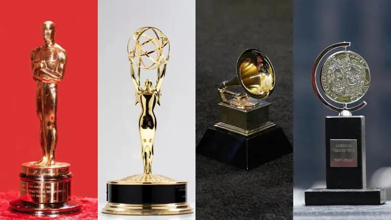

 It seems that with every re-brand there is an avalanche of criticism to immediately follow. In recent times we have seen a lot of online activity with people giving their opinion on the company or associations new logo. I tend to notice that once some time has passed it can be a very different story.
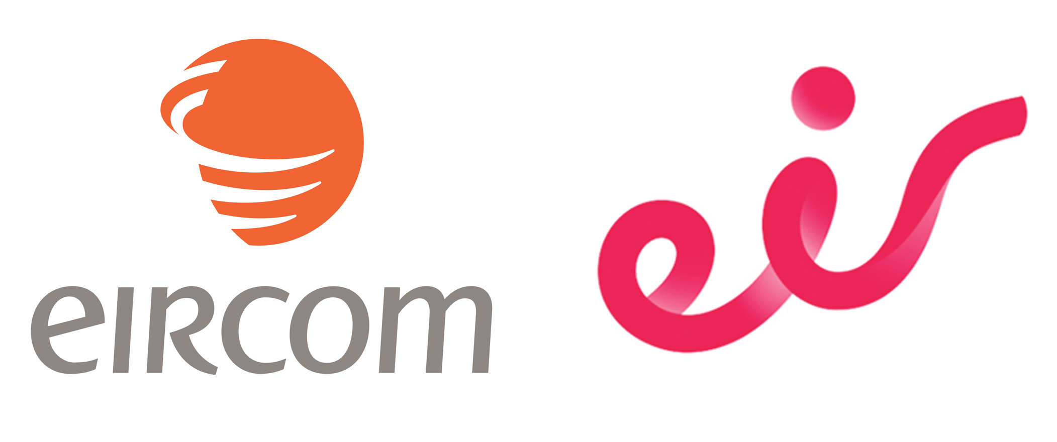
So far this year we have seen some big name re-brands. Some of the more notable ones have been Facebook, Google and just last week Eircom, who not only changed their logo but also their name to Eir. So it got me thinking, why re-brand in the first place?
Firstly, it is important to understand that a brand is a whole lot more than a logo or a “mark” that appears on your stationery or website. It is whole heartedly who you are as a business. It is what you stand for and how good of a service or product you provide.
We can stare at a logo for hours and still not comprehend what it is trying to communicate.
However, when you pair that logo with the company, you make that mental link as to whether it is a good brand or not, one that you would possibly use or walk a mile from and find someone else to do business with. Branding can communicate what your business is about and what it delivers to it’s customers. Implemented in the correct way and supported by great products and services it can establish your business as a leader and build your reputation.
Lets look at Eircom’s reason to re-brand:
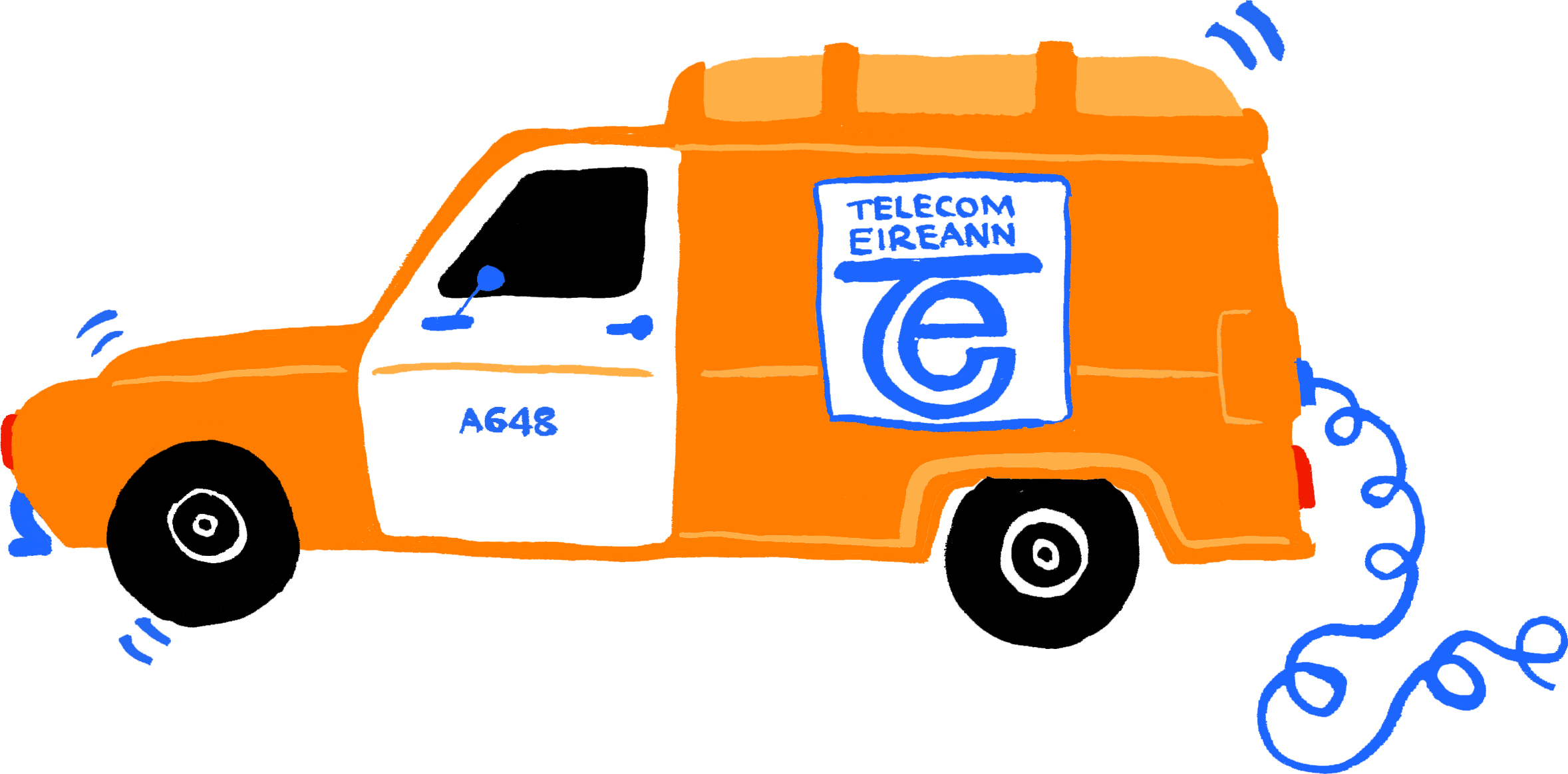
The old logo was introduced in 1999 when the old telecom monopoly Telecom Éireann was privatised and renamed. To me it looks its age, I personally never liked it, a big orange circle with some swoosh marks that look like the cat got at it. Then offset against this some writing that is trying to be modern but still retains some Irish heritage, forget it. I’m afraid it just never worked for me. Now I am sure at the time it served its purpose and was bold in its visual presence.
 Another major factor is that a lot has happened since then, the biggest being that broadband and internet has become an extra limb for us. So much so, that whilst it’s handy to have a landline phone in the house we communicate mostly using our laptops and mobiles. Also in 2013 they started providing a TV subscription. So what was once predominantly a telephone service provider, has now become a major broadband service and TV provider as well.
Also they are no longer the only duck in the pond, they now have to battle it out with other major players in the market. When you consider all these factors, you can see why a re-brand is necessary.
So how do you know when its time to re-brand?
- Do you think your brand looks dated? A good way to tell is by comparing it to the outright market leaders in your industry.
- Does your brand work consistently across all touchpoints? Its important to look consistent and have the same visual language everywhere.
- Are you expecting market growth? Is your brand still delivering the same products/ services as it did when you first started out? As seen above Eircom has changed massively, hence the new look brand.
- Are you still engaging with your target audience? Past methods of engaging with your target market might not be still relevant.
- Are you moving into new markets? International growth may require a new brand identity
- Is your business about to undergo a merger? This is no easy task and finding the correct brand to reflect this is a key element.
A complete re-brand might not always be necessary, certain elements of your existing brand might just need some modifications. In the past a brand’s logo was the keystone to everything and had to be simple, work in black and white and work at any scale. The modern brand has to be agile and adaptive to new platforms. Basically in today’s world, brands have to be resilient enough to cope with fast changing markets that can change in months.
Oh yes, one last thing. I do like the new Eir brand and I feel it ticks all the right boxes. I like it because it is forward thinking, I like its fluidity and I love the bold colour scheme that they have used which suggests a vibrant company. This is also reflected in their packaging where they use bright vibrant colours confidently. Finally I can see it being responsive and resilient enough to last for a very long time.
I am however disappointed that in Irish Design Year 2015 this lucrative contract was won by a UK firm – without sounding too parochial surely we have enough talent and creativity in Ireland to have matched this work?
Ultimately how we view this brand will be very much dependent on the companies delivery of it’s products and services and not on the logo, which after all is just a tangible expression of the renamed company.
 Ray
Ray
Ray Keohane is a graphic designer with Fuzion Graphic Design who have offices in Dublin and Cork