

Whatever your feelings about the current person sitting in the White House in the United States of America until a real President is elected, one thing is without question..
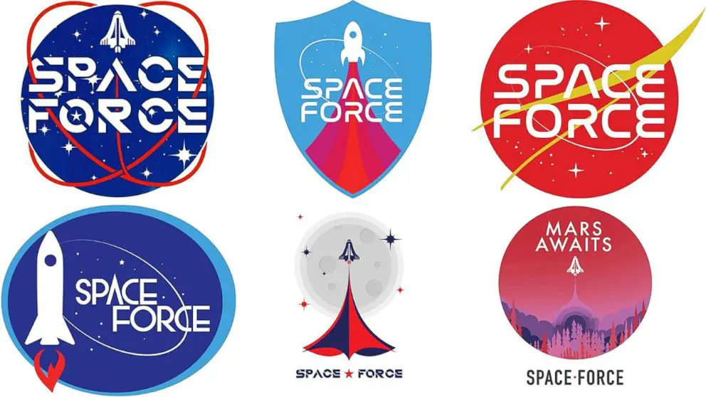
He is a maverick, dealing in things that are bizarre, outrageous, backwards, dangerous, unconstitutional and just damn wrong. He touches more people than is right and correct (all puns intended) and finally, he has laid his tiny hands on the design industry, offering up 6 solutions for a form of open vote for the Space Force, the 6th arm of the American Defence Forces.
Now, we all know how public votes tend to go (Boaty McBoatface, Honey G, Soylent Green flavoured Mountain Dew etc) so, this really isn’t ever going to go any other way other than Awesome, but I do have a two-fold issue with the process of a “Publicly selected piece of design“.
Firstly; offering up a logo or brand with no sense of rationale, qualifications or positioning is insane!!
The majority of those voting will have little or no clue as to the journey that the “designer(s)” (very deliberate quotation marks there BTW) has come to finish up with the designs offered. There will be no conversations around the appropriateness of the design, typefaces, colours and implied and/or subliminal meanings. It’s like asking someone what their favourite track on an album that they have never heard is.
Secondly; this is not the right way to create something that has lasting meaning, that truly adheres to the cornerstones of “branding”; that pays tribute and homage to that which has gone before it (from Buzz Aldrin, the 1986 Challenger disaster, to the joint ISS programme and the Opportunity rover on Mars) and looks towards the essence of what Space exploration and discovery is all about.
And aside from the fact that Space Force is a military operation, not some fluffy pursuit of organic matter – this is about defence, destruction and warfare, so the icons and illustrations on the 6 offered solutions are as much use as a Buzz Lightyear toy with no batteries.
Of course, I am not suggesting that the pursuit of a logo requires a story and a 120 page document to explain why as designers we have selected a typeface/colour/shape combination (you can watch Stefan Sagmeister’s short and sweary* feelings about that here: (its *quite* sweary), but there should be rationale, there should be a reason that elements are being used in an order to make those intangible assets click in our minds, and at a decision making level, these should be presented to help make what is clearly quite an important decision in a format that relies more than a few big VOTE HERE buttons underneath them on a website.
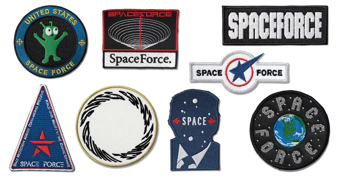
Bloomberg magazine asked a number of designers to throw their hat into the ring, as a counter balance to the work offered by the Trump (Chump!) Administration, and the results are incredible.
The core of the Administration’s xenophobic, racist, self parodying and purile notions have been captured in all their embroidered glory. Have a look and see how absolutely Milton Glaser nails the Commander in Chief.
It’s a work of art and pure genius.
Check out the Bloomberg article.
If Space Force is to become an actual thing, I suggest that we let Jar Jar Binks run it – he’d do a better job, even they had better logos than those on offer!!
 Jonathan