Everyone changes, life happens.
Businesses are no different. A company grows, the economy changes, employees migrate, employees return – this is all part of what makes a business exciting and challenging. As you grow your brand must grow with you. The brand is the essence of what you do, to quote Jeff Bezos of Amazon ‘Your brand is what other people say about you when you’re not in the room‘…you need to make sure people are saying the right thing.
A lot of the time a rebrand can be more interesting than the day one design. Its an evolution rather than a solution. This process of looking at where you started and where you are now can be eye opening. How, where, what and why all come into play. Its a big task to take on, both as a company and from a design point of view.
Lets take 2 examples, one that got it wrong and one that got it right.
The wrong way – Gap.
Internationally renowned clothing store. They have been around a long time and have a logo that represents that. We all know who they are and recognize their logo, but for a brief 6 day period back in 2010, it all changed. That’s right, 6 days!! Take a look…
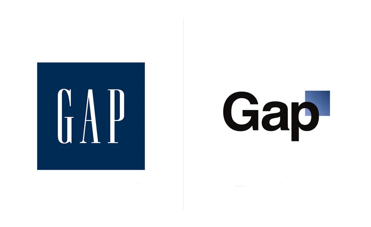 They tried a modern, bold font with a floating blue fading square – what does it mean? Is it progressive? Modern? Trendy? Or just plain terrible? The logo got immediate criticism from all sides and Gap reverted back to their well known logo, almost immediately. It is estimated this brand blunder cost in the region of $100 million.
A lot of money for a Microsoft Paint logo! So how did they get it so wrong? My opinion is lack of research. They went straight to ‘looking cool‘ rather than ‘what we are‘. They wanted something trendy instead of what was right for them. Change for the sake of change is never a good idea and a very costly mistake. But even the top dogs can get it wrong!
The right way – Google
in 2015 Google, the most used word and answer to all our questions, rebranded.
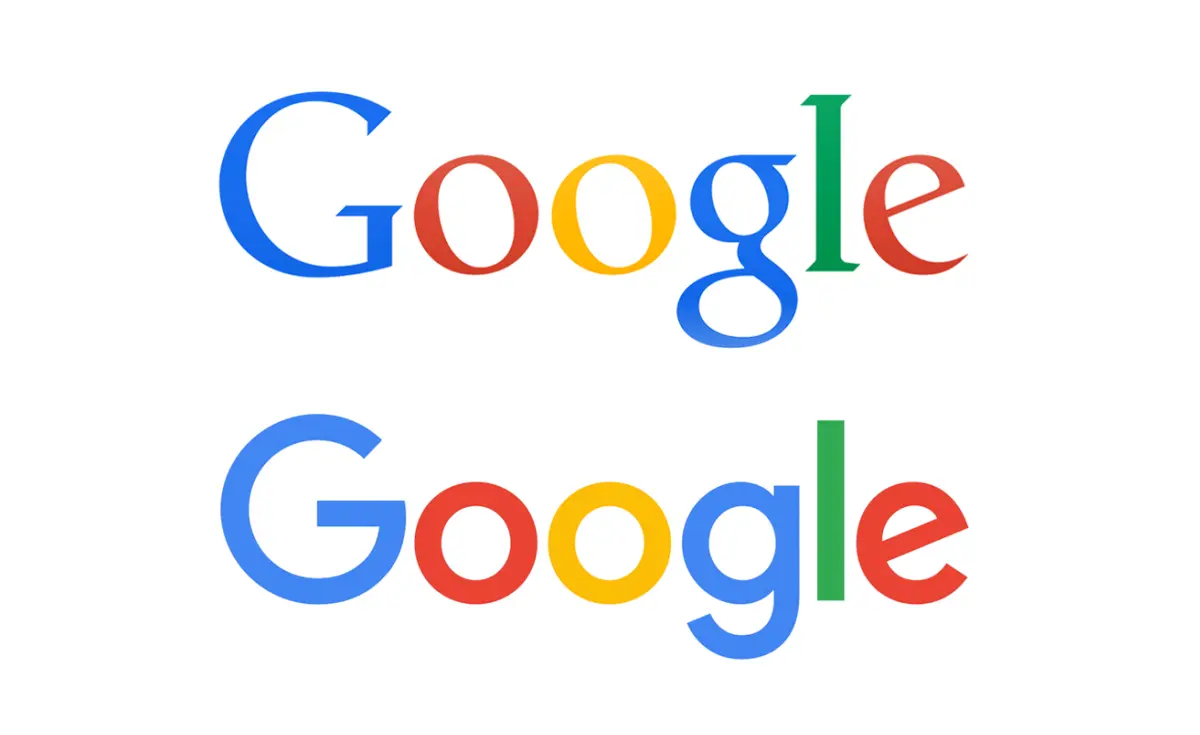 I, for one, love the redesign. Google is representative of our modern day and it needed to meet us here and now. A new sans serif font, slightly softened colours and they held onto the playful tilt in the ‘e’ (also note the clever flow from the ‘g’ into the ‘e’). Simple, friendly and uncluttered. The logo is representative of a modern age and the use of its service across multiple platforms.
The proof that this was a successful rebrand was that it didn’t take long for the world to accept it, almost like it had always been there. This image we see every day changes and we sit back and say ‘That works’.
So, what have we learned? Not everyone needs a rebrand. If you do rebrand, it can go wrong. Research everything, not just your customers but your own business. Have you changed? Have you grown? What do people say about you when you are not in the room?
What would you like them to say?
 Paul Wade
Paul Wade is a Graphic Designer with Fuzion who have offices in Dublin and Cork, Ireland