
Colour has a unique language, and the ability to change its meaning when associated with other colours.
When choosing colours to incorporate into your design, you will have to consider a few issues: contrast and harmony, which affect legibility, but you can also set the mood of a design by using the psychology of colours.
You must be sure your selected colours convey the right message.
Colours have a symbolic association in all societies, depending on the context, and different cultures assign different meanings.
For example, did you know that Green was associated with poison in the 19th century through its link with arsenic, while today it is seen as the colour of spring and sustainability?
The meaning of colour can change over time and of course across different cultures. If you are speaking to an international target audience then you will need to be aware of such differences.
Despite these local differences, colours have universal characteristics. Our brand’s main colour is light blue, which is seen as cool with some notes of calmness, peace and safety.
This is to explain that colour is a powerful tool for us and for you as the eye picks up this difference very quickly.
When we design a website, we use colours to help people navigate through the structure of the website, and when it comes to brochures or catalogues the process is the same: for example, we use visual associations to delineate sections.
When it comes to printing we, as designers, use spot colours and when selecting colours for this, we use a universal matching system known as Pantone.
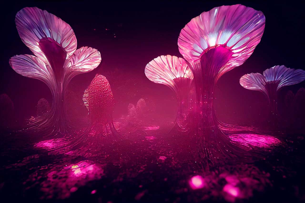
It is a mix from 15 pigments. Colour Institute forecasts global colour trends and advises companies on colour in brand identity and product development. Every year the Institute picks a colour. The Pantone colour of this year is PANTONE 18-1750 Viva Magenta – In case you haven’t heard!
From Leatrice Eiseman, Executive Director of the Pantone Colour Institute:“As virtual worlds become a more prominent part of our daily lives, we look to draw inspiration from nature and what is real. PANTONE 18-1750 Viva Magenta descends from the red family, and is inspired by the red of cochineal, one of the most precious dyes belonging to the natural dye family as well as one of the strongest and brightest the world has known. Rooted in the primordial, PANTONE 18-1750 Viva Magenta reconnects us to original matter. Invoking the forces of nature, it galvanizes our spirit, helping us to build our inner strength.”
So while many of the major paint companies selected a mix of soft neutrals, deep blue-greens and pretty pinks for their colours of the year, Pantone opted to go bold with a lively red.
The world we are living in is a critical context and for sure we all need to be stronger than ever, and Eiseman highlighted it to Time magazine saying: “As 2022 saw ongoing challenges like turbulent politics, the Covid-19 pandemic, and other issues facing our world, this year’s colour was based on an “unconventional time”“.
When thinking about your next challenge, whether it’s design-oriented or life oriented, remember that sometimes going bold is not always a bad thing!
#WinHappy!
Milena
Milena is a senior graphic designer with Fuzion Communications operating from offices in Dublin and Cork, Ireland